


The data-driven solution for results based advertising & creative.
Email us at

info@vooshdigital.com
Built from scratch by the Voosh team in Webflow.
Built from scratch by our own team in Webflow.
January 14, 2026

Problem
Unclear information architecture. No targeted approach. Lack of substance on pages.
Solution
Redesigned user experience for primary ICP without aligning secondary profile.

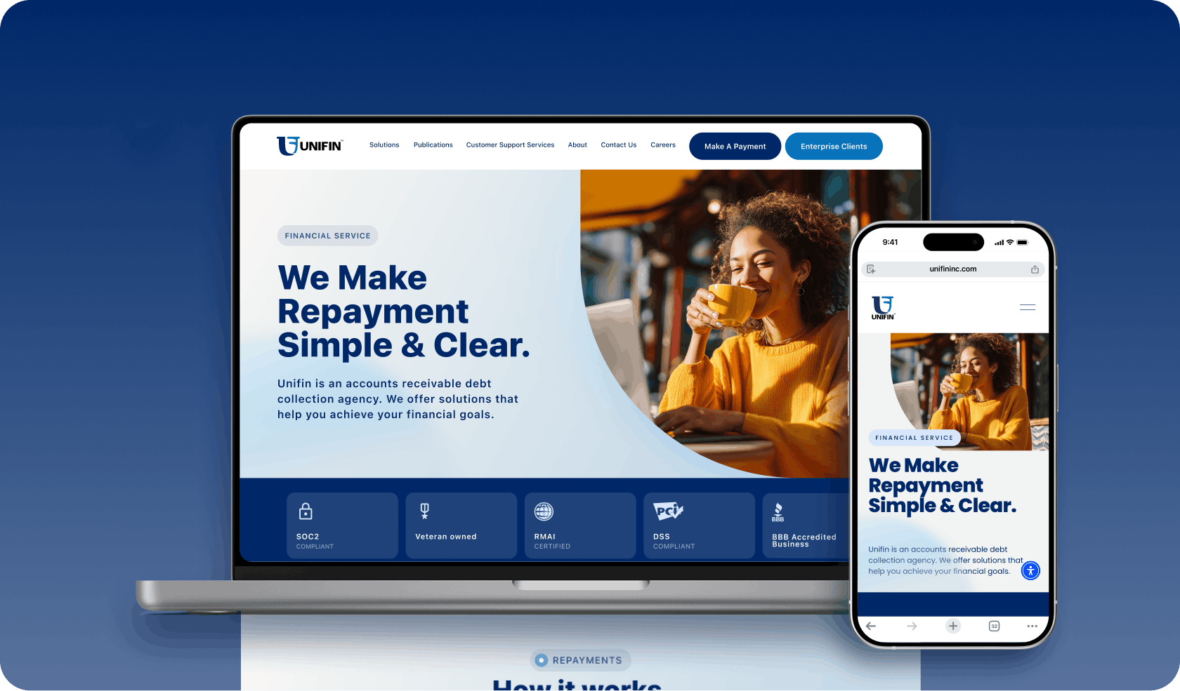
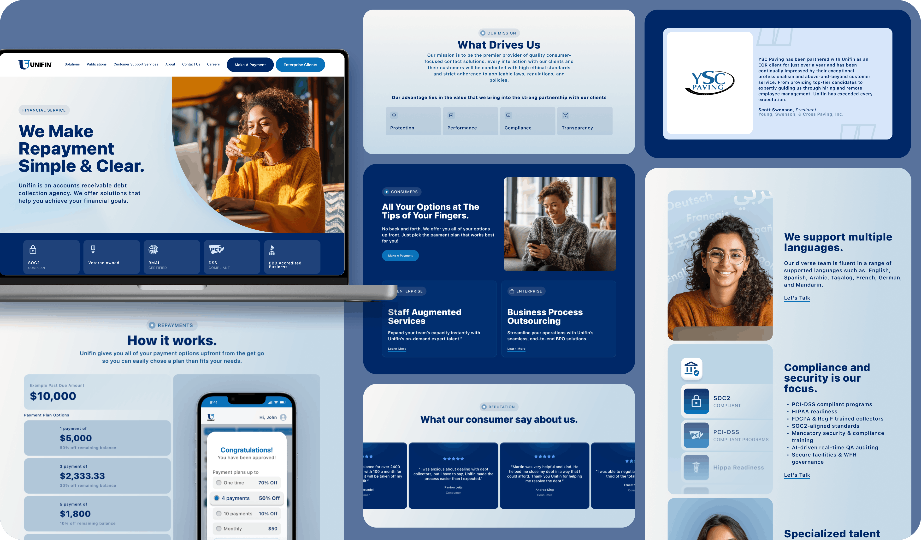
Unifin is a debt collection and financial service agency. Their website was out of date, had unclear messaging, lacked substance, and did not keep their ICP in mind. After we overhauled their email designs, they asked us what we could do to improve their website. After a discovery session with the team we outlined their needs to: educate users on how to login and use their portal, establish trust through reviews and certifications, build a narrative that was targeted at the consumer, while still maintaining and further clarifying content for regulators and client users on separate pages.
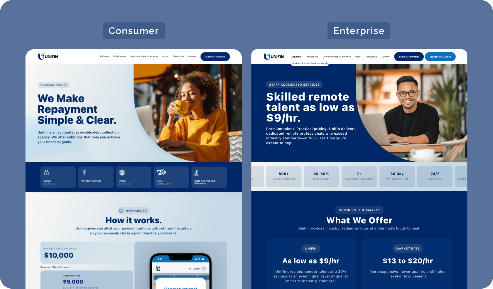
Unifin serves two very different audiences.
Most debt collection websites lean heavily toward enterprise audiences, are content-heavy, and feel institutional, cold, and intimidating. This results in cold and intimidating consumer experiences that increase friction and reduce engagement. This increases friction and reduces consumer engagement. Voosh rethought that model, without compromising trust with enterprise partners.
Consumer
Enterprise
We chose bright colors which reduce anxiety, are more approachable, and promote optimism. Aspirational imagery and smiling faces in open and familiar settings to represent liberation, aspirational relief, and welcome. Rounded corners and softer UI give a feeling of welcome and friendliness. Clear, plain language makes the content approachable and clear to the user. Kept visual density reduced to improve scanability and comprehension.
Design choices were not purely aesthetic; they were psychological. Every element was selected to lower emotional friction and encourage action.
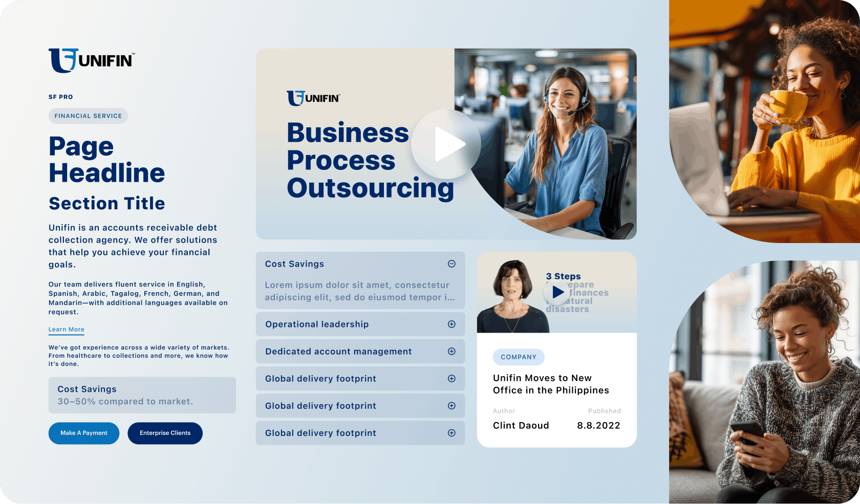
The design system was developed in Figma with scalability in mind, ensuring consistency across pages while allowing flexibility for future growth. When using Squarespace as our site builder, we need to adhere to the component parameters that are preset and style them accordingly. This is a benefit for clients who don’t need complex design systems. It’s lean, scalable, and foolproof, making handoff to internal much easier to manage. This design system allows for future pages to be created with minimal to no design lift.
Our workflow for clients using Squarespace is lean and simple. Allowing the client to have visibility into decisions, contribute their direction, and condense the number of decisions for them to make in just two or three meetings. Meetings are broken out by discovery, content, and design.
Discovery Session: This meeting involves the client teaching us about their ICP, outlining the new needs of the site, where their current site falls short, and any specific considerations. We then take that information, research, plan, and ideate.
UX, Journey Mapping, Content Mapping: In this meeting, we review the architecture of the site and gather content in our documentation tool, Coda. Hammering out the sites architecture early on allows our developers to get started on the foundational elements of the site while our designers work on the UI, optimising the timeline. Reviewing content on a documentation tool vs designs allows all parties to focus on it and not get distracted by too many elements. Documents are the source of truth, meaning clients can leave comments notifying our team of an update in the copy, which allows us to easily update designs and the site.
High Fidelity Designs: Our designer puts together a few different design options on one or two key pages. The team at Unifin chose their favorite one, gave some feedback on specific features, and we were able to design and build the rest of those pages using their chosen style. All that was left at the end was a final QA, which is done internally and by the client in off-peak hours.
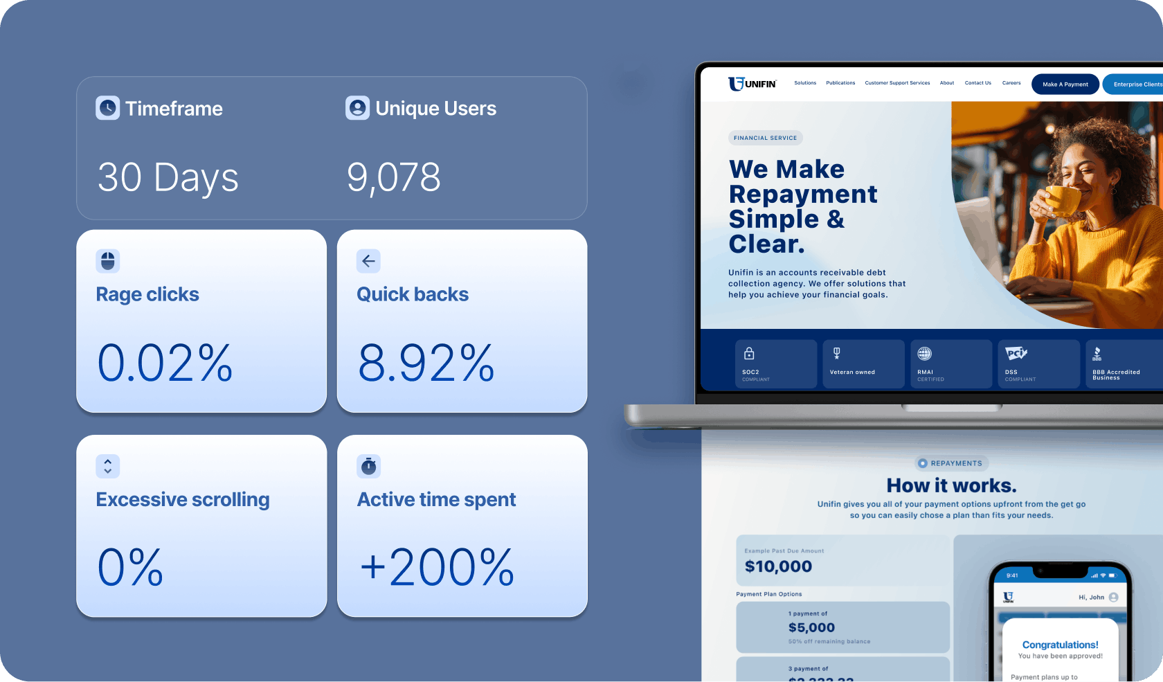
As a result of all these changes, we’re seeing early indicators of a reduction in complaints and an increase in users clicking the primary CTA “Make a Payment.”
Based on reviewing recorded user sessions using Microsoft Clarity, we’re also seeing more focused user sessions.
We’re seeing:
Indicating an overall more focused journey.
The qualitative user feedback is that the new website is:

Used tools
Retail Media
eCommerce
Industry
Consumer Care / Professional Grooming
View Study
Used tools
eCommerce
Industry
Furniture
View Study
Used tools
Branding
Organic Social
Industry
Health, Beauty & Wellness
View Study
Used tools
eCommerce
Industry
Food
View Study
Used tools
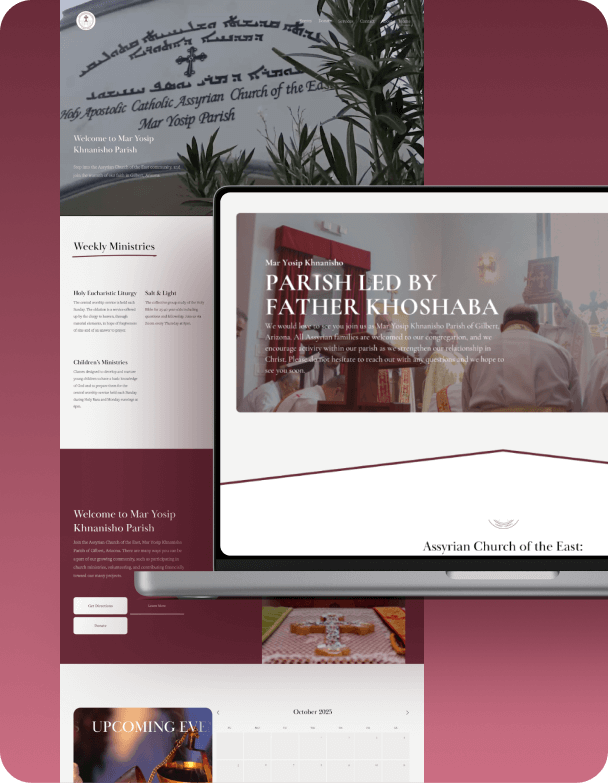
Web
Industry
Non Profit
View Study
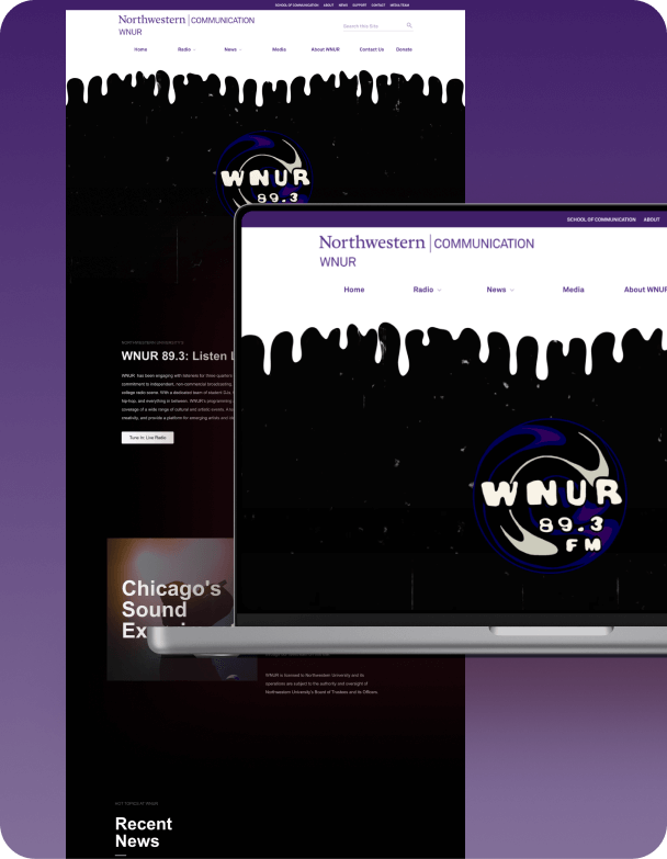
Used tools
Web
Industry
Radio
View Study

Used tools
Web
Industry
Legal
View Study

Used tools
Web
Industry
Health
View Study
The data-driven solution for results based advertising & creative.
Email us at
info@vooshdigital.com
Built from scratch by the Voosh team in Webflow.
Built from scratch by our own team in Webflow.